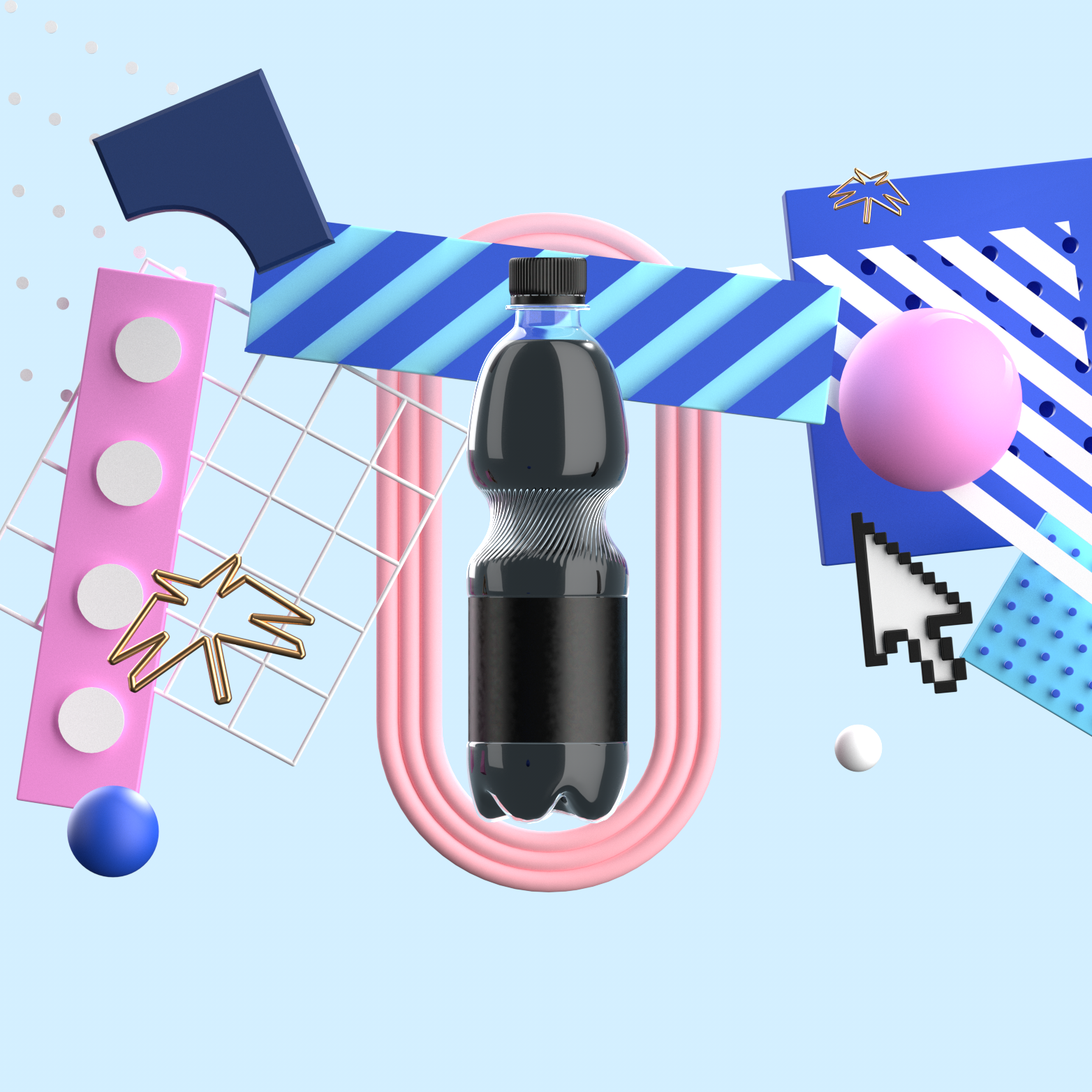
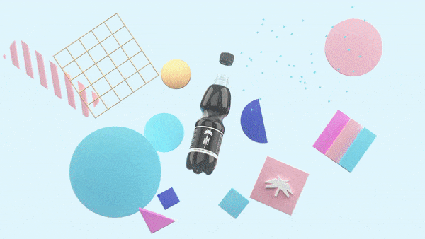
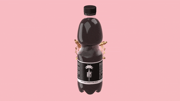
I was approached by the client to present a new cola drink AFRICOLA. We landed on the concept of mixing retro Memphis elements with more modern motion graphics.
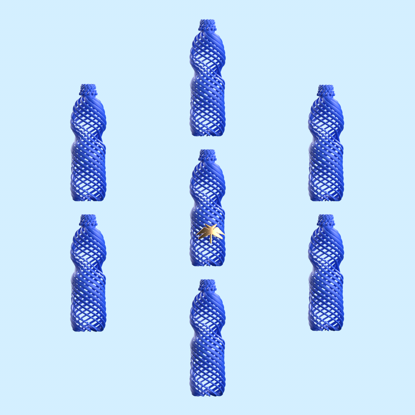
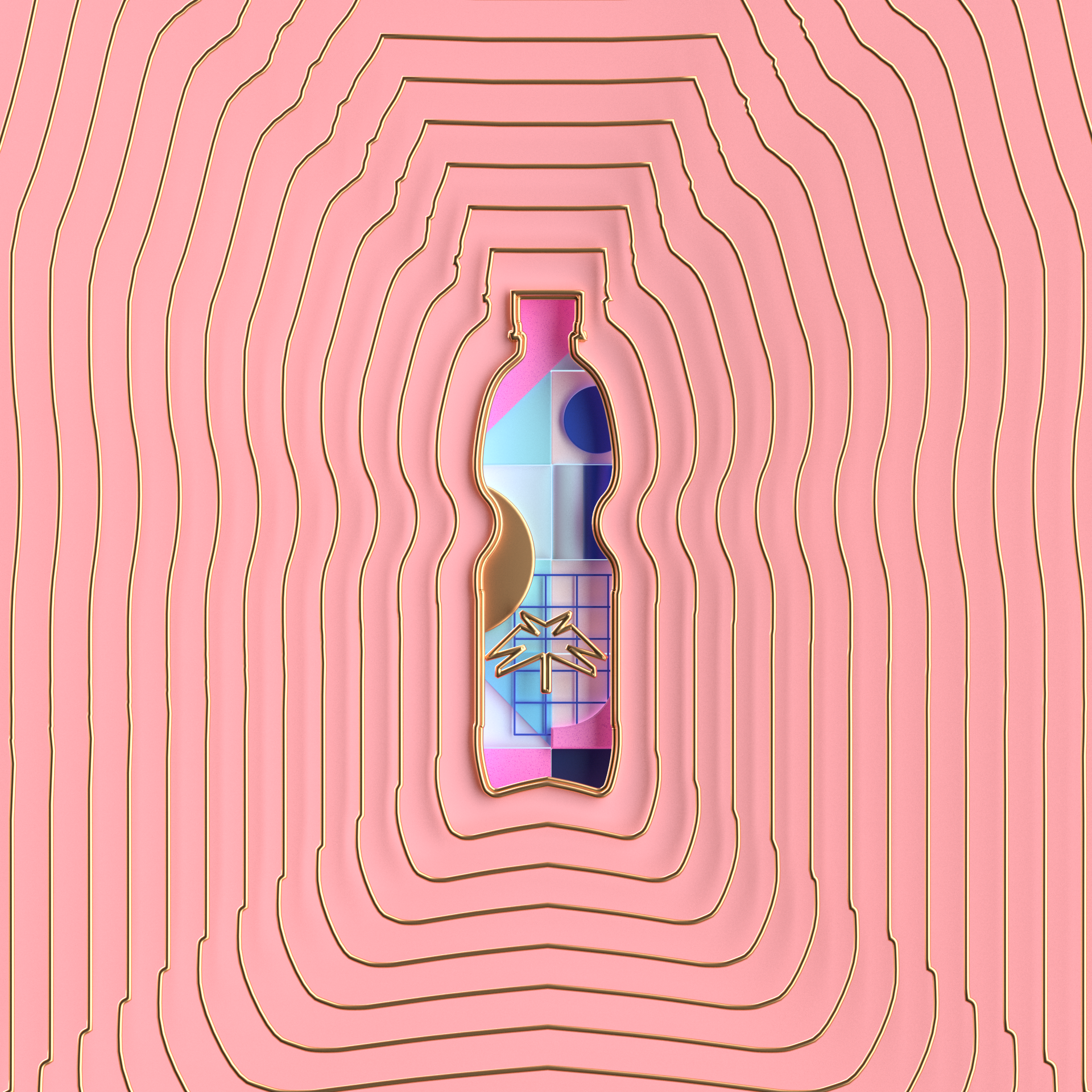
The logo in the shape of a palm tree was used as a unifying element between cuts.
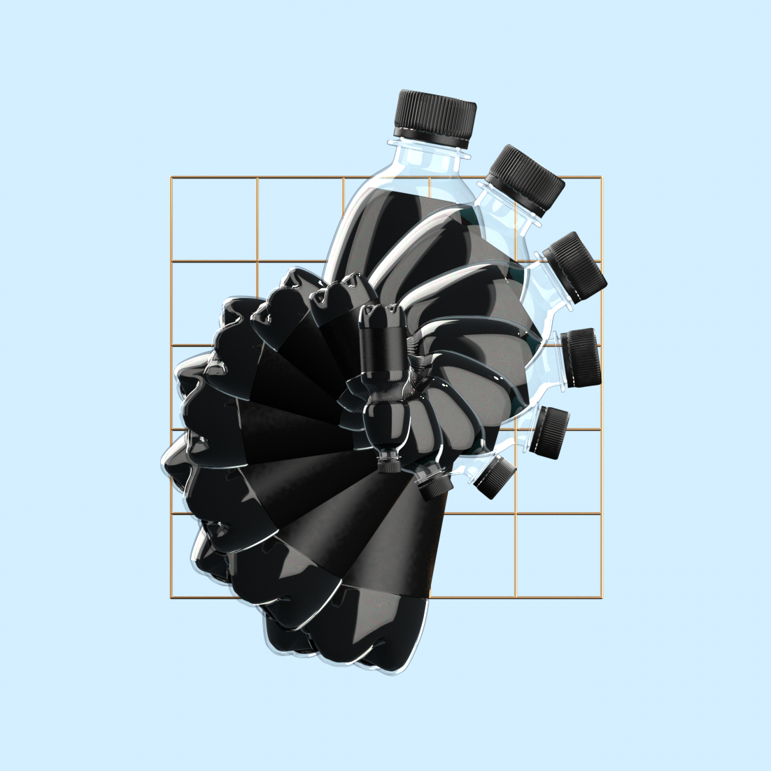
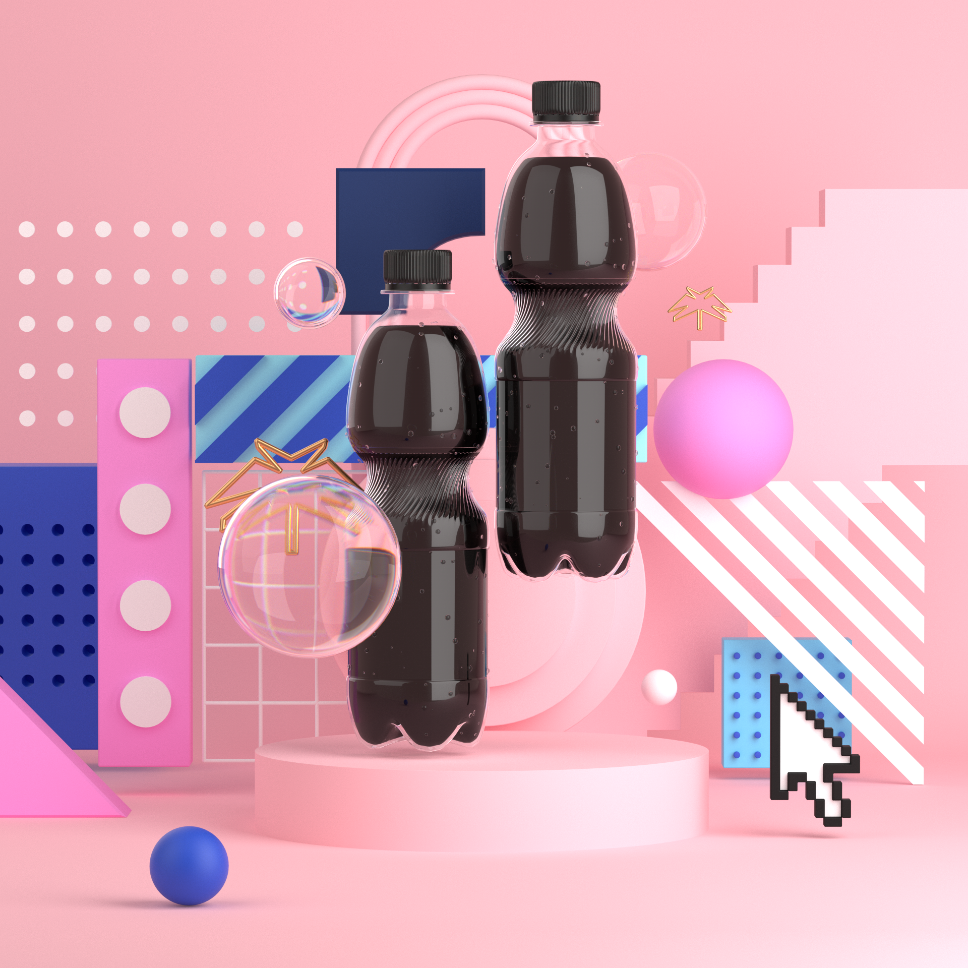
The sharp edges of the logo contrasts with the roundness of the bottle so the idea of contrast became a key concept for this showcase: Alternation between the grids and the chaos, the retro and the modern, and between the black color of cola and the colorful pastel palette..
The logo in the shape of a palm tree was used as a unifying element between cuts.
The sharp edges of the logo contrasts with the roundness of the bottle so the idea of contrast became a key concept for this showcase: Alternation between the grids and the chaos, the retro and the modern, and between the black color of cola and the colorful pastel palette..